This section covers Tool Panels, available via the grid's Side Bar, which allow for easy access to powerful grid operations such as grouping, pivoting, and filtering. Custom Tool Panels can also be provided to the grid.
Overview Copy Link
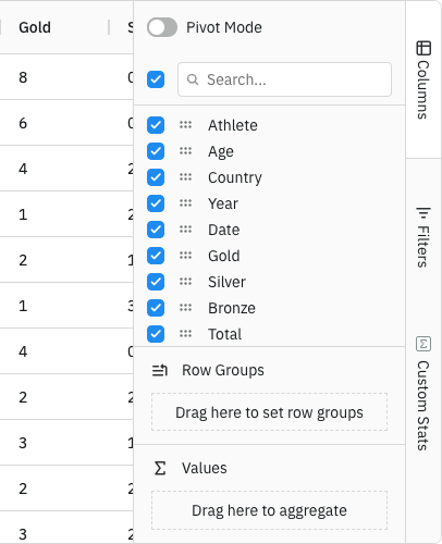
Tool Panels are panels that sit in the Side Bar to the right of the grid. The Side Bar allows access to the tool panels via buttons that work like tabs. The Side Bar and a Tool Panel are shown in the screenshot below.
Provided Tool Panels Copy Link
The grid provides the following Tool Panels:
- Columns Tool Panel - to control aggregations, grouping and pivoting.
- Filters Tool Panel - to perform multiple column filters.
- New Filters Tool Panel - a redesigned version of the Filters Tool Panel that provides improved UX.
Custom Tool Panels Copy Link
In addition to the provided Tool Panels, it is also possible to provide custom Tool Panels.
For more details refer to the section: Custom Panel.
API Copy Link
The gridApi has the following methods that can be used to interact with the tool panel.
Opens a particular tool panel. Provide the ID of the tool panel to open.
Optionally, provide a parent element to attach the tool panel to. |
Closes the currently open tool panel (if any). |
Returns the ID of the currently shown tool panel if any, otherwise null. |
Returns true if the tool panel is showing, otherwise false. |
Force refreshes all tool panels by calling their refresh method. |
Gets the tool panel instance corresponding to the supplied id. |
Events Copy Link
The following events are emitted from the tool panel.
The tool panel visibility has changed. Fires twice if switching between panels - once with the old panel and once with the new panel. |
The tool panel size has been changed. |
The column menu visibility has changed. Fires twice if switching between tabs - once with the old tab and once with the new tab. |
The context menu visibility has changed (opened or closed). |