Date Filters allow you to filter date data.
Configure as follows:
const [columnDefs, setColumnDefs] = useState([
    {
        field: 'date',
        // configure column to use the Date Filter
        filter: 'agDateColumnFilter',
        filterParams: {
            // pass in additional parameters to the Date Filter
        },
    },
]);

<AgGridReact columnDefs={columnDefs} />
The example below shows the Date Filter in action:
- The Date column is using a Date Filter.
- A Date Filter Comparator is provided to parse the data and allow date comparisons to be made.
- The minimum valid year is set to
2000, and maximum valid year is2021. Dates outside this range will be considered invalid, and will:- Deactivate the column filter. This avoids the filter getting applied as the user is typing a year - for example suppose the user is typing the year
2008, the filter doesn't execute for values2,20or200(as the text2008is partially typed). - Be highlighted with a red border (default theme) or other theme-appropriate highlight.
- Deactivate the column filter. This avoids the filter getting applied as the user is typing a year - for example suppose the user is typing the year
- the
inRangeFloatingFilterDateFormatproperty has been set to define a custom date format, this is only shown in the floating filter panel when an in-range filter has been applied.
Configuration
Date Filters are configured though the filterParams attribute of the column definition (IDateFilterParams interface):
Date Range
The example below demonstrates configuring date range filtering in the Date Filter with minimum and maximum validation dates:
- The
minValidDateparameter is set to2008-01-08using a string. - The
maxValidDateis dynamically set to tomorrow's date using JavaScript's Date object. - Together,
minValidDateandmaxValidDaterestrict the selectable date range. - Any manually entered or selected dates outside the valid range will be invalid.
Filter Comparator
Dates can be represented in your data in many ways e.g. as a JavaScript Date object, as a string in a particular format such as '26-MAR-2020', or something else. How you represent dates will be particular to your application.
By default, the date filter assumes you are using JavaScript Date objects. If this is the case, the date filter will work out of the box. However, if your date is in any other format you will have to provide your own comparator to perform the date comparisons.
The comparator function takes two parameters. The first parameter is a JavaScript Date object for the selected date in the filter (with the time set to midnight). The second parameter is the current value of the cell in the row being evaluated. The function must return:
- Any number < 0 if the cell value is less than the filter date.
- 0 if the dates are the same.
- Any number > 0 if the cell value is greater than the filter date.
This pattern is intended to be similar to the JavaScript compareTo(a, b) function.
Below is an example of using a date filter with a comparator.
const [columnDefs, setColumnDefs] = useState([
    // column definition configured to use a date filter
    {
        field: 'date',
        filter: 'agDateColumnFilter',
        // add extra parameters for the date filter
        filterParams: {
            // provide comparator function
            comparator: (filterLocalDateAtMidnight, cellValue) => {
                const dateAsString = cellValue;

                if (dateAsString == null) {
                    return 0;
                }

                // In the example application, dates are stored as dd/mm/yyyy
                // We create a Date object for comparison against the filter date
                const dateParts = dateAsString.split('/');
                const year = Number(dateParts[2]);
                const month = Number(dateParts[1]) - 1;
                const day = Number(dateParts[0]);
                const cellDate = new Date(year, month, day);

                // Now that both parameters are Date objects, we can compare
                if (cellDate < filterLocalDateAtMidnight) {
                    return -1;
                } else if (cellDate > filterLocalDateAtMidnight) {
                    return 1;
                }
                return 0;
            }
        }
    }
]);

<AgGridReact columnDefs={columnDefs} />
Once the date comparator callback is provided, then the Date Filter is able to perform all the comparison operations it needs, e.g. 'Less Than', 'Greater Than' and 'Equals'.
Filter Model
The Filter Model describes the current state of the applied Date Filter. The Date Filter Model represents the Date as a string in format 'YYYY-MM-DD', however when doing comparisons the date is provided as a JavaScript Date object as that's what date pickers typically work with. The model uses string representation to make it easier to save and avoid any timezone issues.
If only one Filter Condition is set, this will be a DateFilterModel:
If more than one Filter Condition is set, then multiple instances of the model are created and wrapped inside a Combined Model (ICombinedSimpleModel<DateFilterModel>). A Combined Model looks as follows:
// A filter combining multiple conditions
interface ICombinedSimpleModel<DateFilterModel> {
    filterType: string;

    operator: JoinOperator;

    // multiple instances of the Filter Model
    conditions: DateFilterModel[];
}

type JoinOperator = 'AND' | 'OR';
Note that in AG Grid versions prior to 29.2, only two Filter Conditions were supported. These appeared in the Combined Model as properties condition1 and condition2. The grid will still accept and supply models using these properties, but this behaviour is deprecated. The conditions property should be used instead.
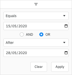
An example of a Filter Model with two conditions is as follows:
// Date Filter with two conditions, both are equals type
const dateEquals04OrEquals08 = {
    filterType: 'date',
    operator: 'OR',
    conditions: [
        {
            filterType: 'date',
            type: 'equals',
            dateFrom: '2004-08-29'
        },
        {
            filterType: 'date',
            type: 'equals',
            dateFrom: '2008-08-24'
        }
    ]
};
Filter Options
The Date Filter presents a list of Filter Options to the user.
The list of options are as follows:
| Option Name | Option Key | Included by Default |
|---|---|---|
| Equals | equals | Yes |
| Does not equal | notEqual | Yes |
| Before | lessThan | Yes |
| After | greaterThan | Yes |
| Between | inRange | Yes |
| Blank | blank | Yes |
| Not blank | notBlank | Yes |
| Choose one | empty | No |
Note that the empty filter option is primarily used when creating Custom Filter Options. When 'Choose one' is displayed, the filter is not active.
The default option for the Date Filter is equals.
Filter Values
By default, the values supplied to the Date Filter are retrieved from the data based on the field attribute. This can be overridden by providing a filterValueGetter in the Column Definition. This is similar to using a Value Getter, but is specific to the filter.
Date Selection Component
By default the grid will use the browser-provided date picker for all Supported Browsers, but for other browsers it will provide a simple text field. To override this and provide a custom date picker, see Date Component.
It is also possible to enable a native date picker for unsupported browsers by setting filterParams.browserDatePicker = true. However, you will need to test this behaviour yourself.
Custom Selection Component
You can provide a Date Selection Component to replace the default.
The example below shows how to register a custom date component that contains an extra floating calendar picker rendered from the filter field. The problem with this approach is that we have no control over third party components and therefore no way to implement a preventDefault when the user clicks on the Calendar Picker (for more info see Custom Floating Filter Example). Our way of fixing this problem is to add the ag-custom-component-popup class to the floating calendar.
Custom date components are controlled components, which receive a date value as part of the props, and pass date value updates back to the grid via the onDateChange callback. Note that the date is applied immediately when onDateChange is called.
export default ({ date, onDateChange }) => {
   ...
   return (
       <input
           type="date"
           value={convertToString(date)}
           onChange={({ target: { value } }) => onDateChange(convertToDate(value))}
       />
   );
}
In previous versions of the grid, custom components were declared in an imperative way. See Migrating to Use reactiveCustomComponents for details on how to migrate to the current format.
The following props are passed to the custom date components (CustomDateProps interface).
The following callbacks can be passed to the useGridDate hook (CustomDateCallbacks interface). All the callbacks are optional, and the hook only needs to be used if callbacks are provided.
Applying the Filter
Applying the Date Filter is described in more detail in the following sections:
Blank Cells
If the row data contains blanks (i.e. null or undefined), by default the row won't be included in filter results. To change this, use the filter params includeBlanksInEquals, includeBlanksInLessThan, includeBlanksInGreaterThan and includeBlanksInRange. For example, the code snippet below configures a filter to include null for equals, but not for less than, greater than or in range (between):
const filterParams = {
    includeBlanksInEquals: true,
    includeBlanksInLessThan: false,
    includeBlanksInGreaterThan: false,
    includeBlanksInRange: false,
};
In the following example you can filter by date and see how blank values are included. Note the following:
- Column Date has both
nullandundefinedvalues resulting in blank cells. - Toggle the controls on the top to see how
includeBlanksInEquals,includeBlanksInLessThan,includeBlanksInGreaterThanandincludeBlanksInRangeimpact the search result.
Data Updates
The Date Filter is not affected by data changes. When the grid data is updated, the filter value will remain unchanged and the filter will be re-applied based on the updated data (e.g. the displayed rows will update if necessary).
Next Up
Continue to the next section to learn about Set Filters.