The Set Filter takes inspiration from Excel's AutoFilter and allows filtering on sets of data.
Set Filter Sections Copy Link
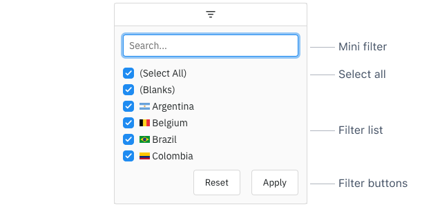
The Set Filter is comprised of the following sections:
- Mini Filter: used to narrow the values available for selection inside the Filter List.
- Select All: used to select / deselect all values shown in the Filter List.
- Filter List: a list of Set Filter Values which can be selected / deselected to set the filter.
- Filter Buttons: Action buttons that can be optionally added to the bottom of the Set Filter.
Enabling Set Filters Copy Link
The Set Filter is the default filter used in AG Grid Enterprise (unless it has been Suppressed by Default or the SetFilterModule has not been registered), but it can also be explicitly configured as shown below:
const gridOptions = {
    columnDefs: [
        // Set Filter is used by default in Enterprise version
        { field: 'athlete', filter: true },
        // explicitly configure column to use the Set Filter
        { field: 'country', filter: 'agSetColumnFilter' },
    ],

    // other grid options ...
}
The following example demonstrates how the Set Filter can be enabled. Note the following:
- The Athlete column has
filter=truewhich defaults to the Set Filter as this example is using AG Grid Enterprise. - The Country column is explicitly configured to use the Set Filter using
filter='agSetColumnFilter'. - All other columns are configured to use the Number Filter using
filter='agNumberColumnFilter'. - Filters can be accessed by clicking on the filter icon in the Floating Filters.
Suppress Set Filter by Default Copy Link
When filter = true, the Set Filter is used for AG Grid Enterprise by default. To use the Text Filter, Number Filter or Date Filter instead based on the Cell Data Type (as in AG Grid Community), set the grid option suppressSetFilterByDefault = true.
Set Filter Parameters Copy Link
Set Filters are configured though the filterParams attribute of the column definition (ISetFilterParams interface):
Set to true to apply the Set Filter immediately when the user is typing in the Mini Filter. |
Specifies the buttons to be shown in the filter, in the order they should be displayed in. The options are: 'apply': If the Apply button is present, the filter is only applied after the user hits the Apply button. 'clear': The Clear button will clear the (form) details of the filter without removing any active filters on the column. 'reset': The Reset button will clear the details of the filter and any active filters on that column. 'cancel': The Cancel button will discard any changes that have been made to the filter in the UI, restoring the applied model. |
If true, enables case-sensitivity in the SetFilter Mini-Filter and Filter List. |
The height of values in the Filter List in pixels. |
Similar to the Cell Renderer for the grid. Setting it separately here allows for the value to be rendered differently in the filter.
|
If the Apply button is present, the filter popup will be closed immediately when the Apply or Reset button is clicked if this is set to true. |
Comparator for sorting. If not provided, the Column Definition comparator is used. If Column Definition comparator is also not provided, the default (grid provided) comparator is used.
|
Overrides the default debounce time in milliseconds for the filter. Defaults are: TextFilter and NumberFilter: 500ms. (These filters have text field inputs, so a short delay before the input is formatted and the filtering applied is usually appropriate). DateFilter and SetFilter: 0ms |
By default, when the Set Filter is opened all values are shown selected. Set this to true to instead show all values as de-selected by default. This does not work when excelMode is enabled.
|
Changes the behaviour of the Set Filter to match that of Excel's AutoFilter.
|
Function to return a string key for a value. This is required when the filter values are complex objects, or when treeList = true and the column is a group column with Tree Data or Grouping enabled. If not provided, the Column Definition Key Creator is used.
|
If set to true, disables controls in the filter to mutate its state. Normally this would be used in conjunction with the Filter API. |
Refresh the values every time the Set filter is opened.
|
If true, hovering over a value in the Set Filter will show a tooltip containing the full, untruncated value. |
By default, if using provided filter values and there is an active filter model, when the filter values are refreshed such that every value is in the filter model, the filter model will be cleared (reset to null). To prevent this behaviour, set this property to true. This is useful if using SSRM and updating the filter values based on other column filters.
|
Set to true to hide the Mini Filter. |
Set to true to remove the Select All checkbox. |
If true, the Set Filter values will not be sorted. Use this if you are providing your own values and don't want them sorted as you are providing in the order you want. |
If specified, this formats the text before applying the Mini Filter compare logic, useful for instance to substitute accented characters.
|
If true, the Set Filter List will be displayed in a tree format. If enabled, one of the following must be true: treeListPathGetter is provided to get the tree path for the column values. Date, in which case the tree will be year -> month -> day. |
Requires treeList = true. If specified, this formats the tree values before they are displayed in the Filter List.
pathKey - The key for the current node in the tree.
level - The level of the current node in the tree (starting at 0).
parentPathKeys - The keys of the parent nodes up until the current node (exclusive). This will be an empty array if the node is at the root level.
|
Requires treeList = true. If provided, this gets the tree path to display in the Set Filter List based on the column values. Each row must map to a leaf value in the tree.
|
If specified, this formats the value before it is displayed in the Filter List. If a Key Creator is provided (see keyCreator), this must also be provided.
|
The values to display in the Filter List. If this is not set, the filter will take its values from what is loaded in the table.
|
Updating Set Filter Parameters Copy Link
When new column definitions are set with updated Set Filter parameters, the Set Filter will update to reflect these. For certain filter parameters, changing the parameter will invalidate the filter model. This will cause the filter to be reset.
The following filter parameters will reset the Set Filter - treeList, treeListPathGetter, caseSensitive, comparator, and excelMode.
Additionally, a few column definition properties will also reset the Set Filter - filterValueGetter, keyCreator (unless specified in both the old and new filter parameters), and valueFormatter (if no keyCreator and the Cell Data Type is not 'number' or 'text').
For the parameters above which are functions, define them as constants outside of the column definition to avoid resetting the Set Filter when passing new column definitions.